Artcrank Memories
Artcank Minneapolis is on a call for artists right now for the 2015 show. It got me thinking about all the fun experiences I've been able to be a part of with Artcrank over the past years. Artcank is a poster party for bike people. Charles Youel, who created the idea, curates a selection of artists to participate in the show to create a poster on the theme of bikes. He does this within a variety of cities throughout the US, as well as some worldwide. It’s an amazing organization and I have always been a huge supporter.

Here I'll be doing a feature on some process from some of my past Artcrank posters. You’ll find some initial ideas and sketches and some thought behind each poster created. Here's Artcrank on my site, and be sure to check out Artcrank.com for tons of others. Right now, there's a call for artists in Minneapolis, so if you're in town, be sure to submit to be a part! (Submit by April 4th, 2015)
Onto the art...
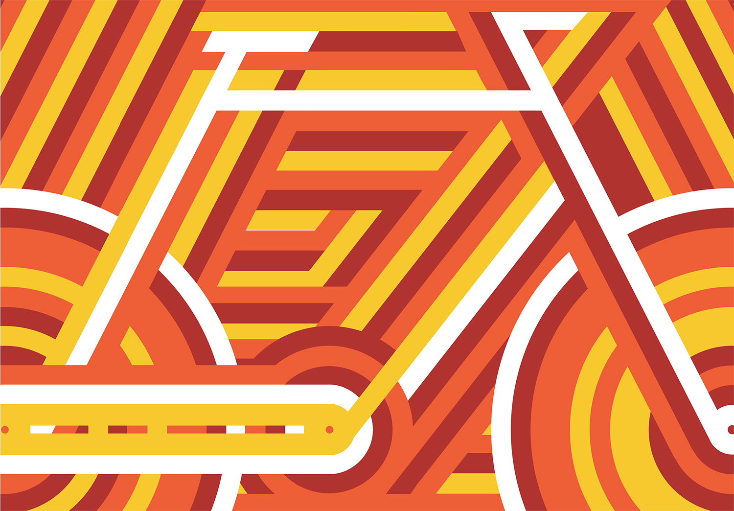
Above: Momentum (2010) was my very first Artcrank poster. It was focused around the geometric angles of the bike frame. The movement of the bicycle is mimicked through the repetitious lines. The interconnectedness are what bring the abstract bicycle parts and form together. It creates an intertwining illusion, a texture, a sense of depth and a symbol of the art of the bicycle. The posters were printed by Steady Print Shop Co.
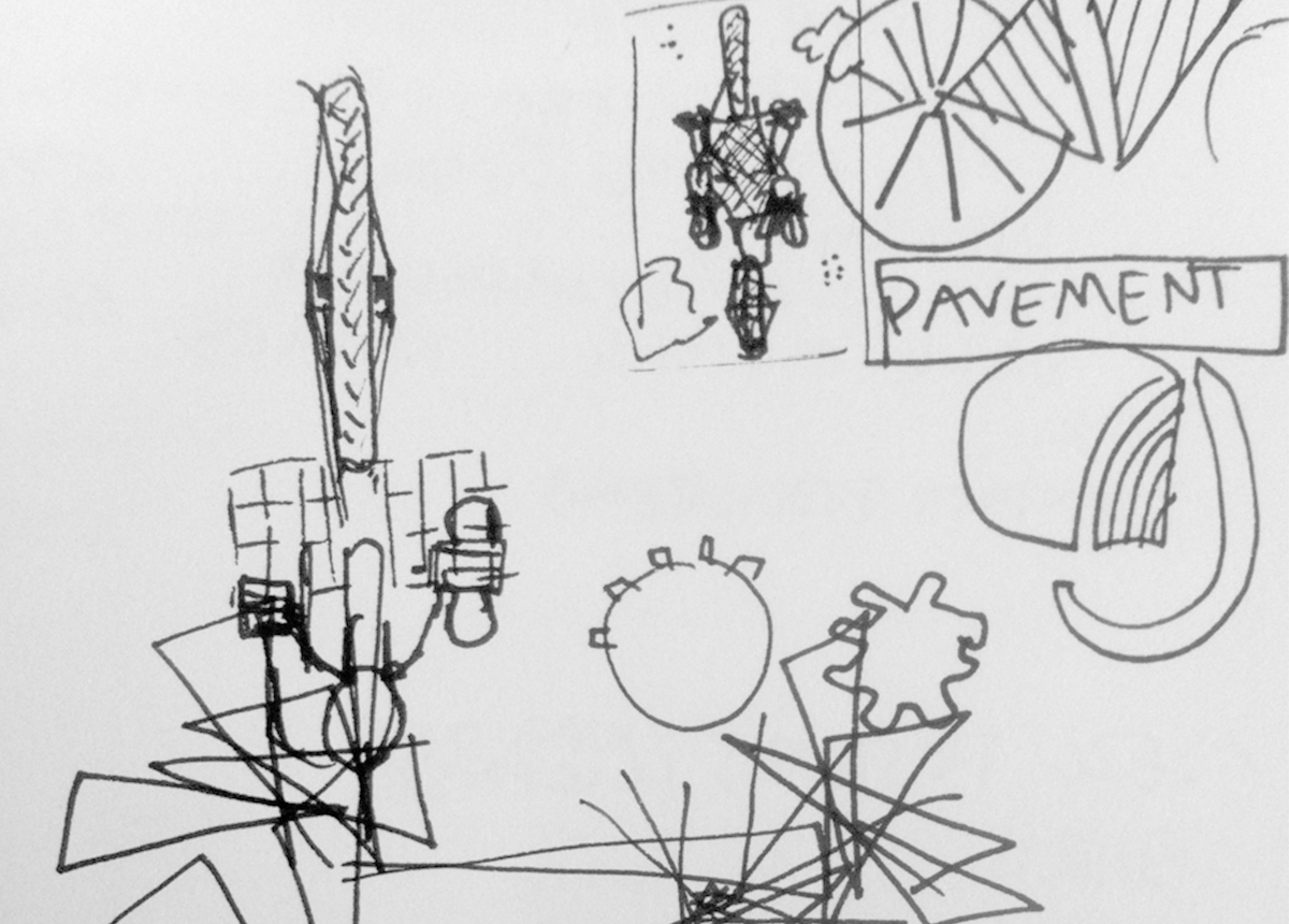
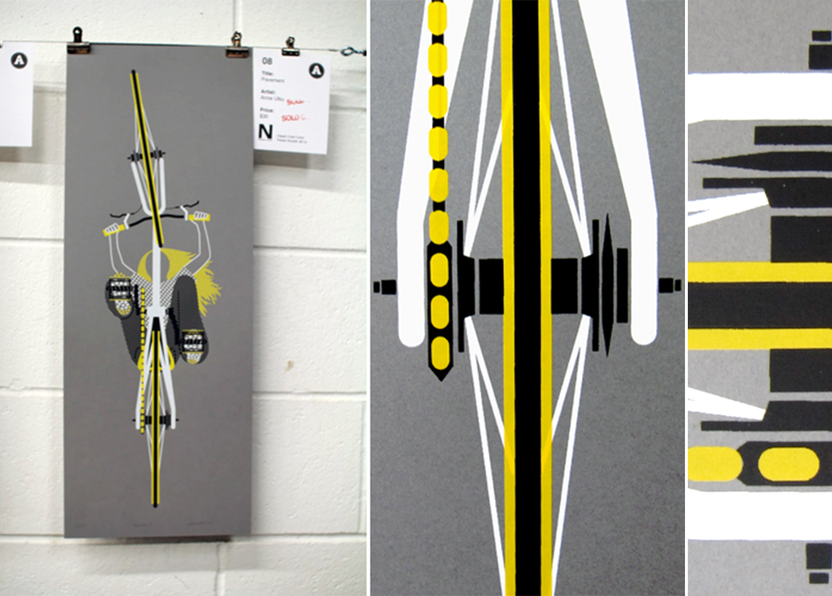
Above: My second Artcrank show, I created Pavement (2011) — a poster acting as the pavement, looking up and under a bicycle. This was a new experimental perspective for me to create that came to me because I would always hang my bike up on the wall in my studio apartment. It’s an interesting viewpoint that no one would ever see, unless I guess, if you’re riding through the air (…maybe someday?)
Above: Interbike was a selection of artists from around the world to display posters at a large bicycle convention. For this show I created Infinite (2011) which was meant to be an abstract, artistic version of my dream bicycle. I went back to the first patented diagram sketch of the human velocipede and was inspired how revolutionary the idea was back then. This centuries-old invention had solid form and purpose to allow for a future of infinite possibilities in design, manufacturing, interpretation, art, and traveling unto limitless lengths. This poster, Infinite, is my diagram for a new revolutionary bicycle that I want in my world some day—which, by the looks of it, would be impossible to function, but again, is anything impossible?
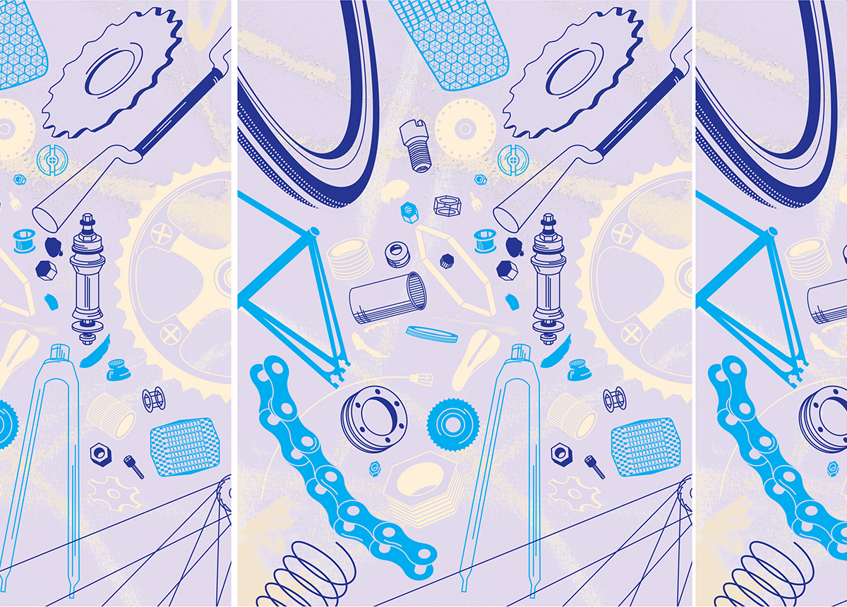
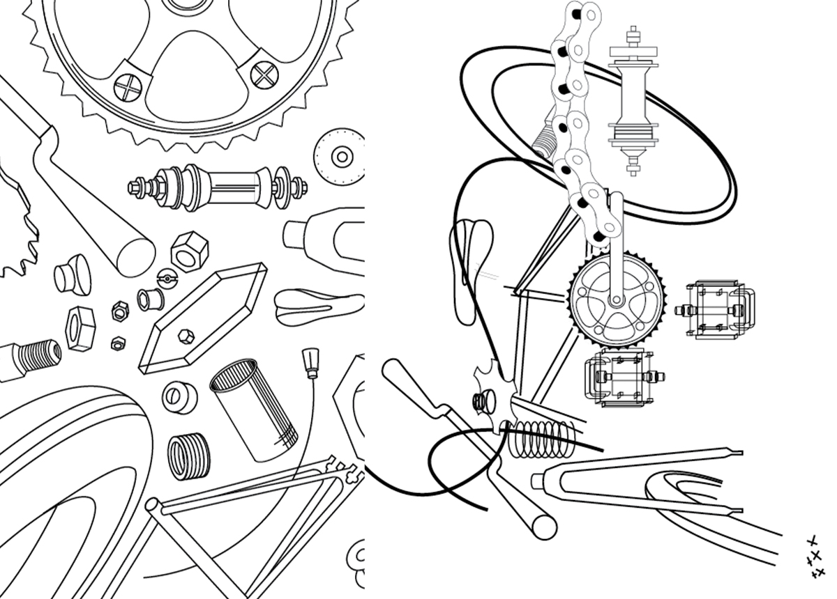
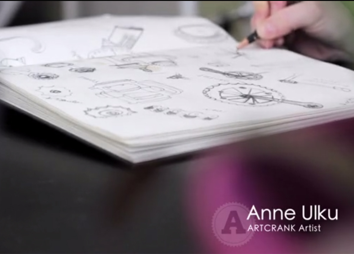
Above: Build (2012) was about just that, the parts and pieces it takes to build a bicycle together. When scattered about, there brings in more appreciation for the individual parts that make up the form of a bike. I was interested in making this a piece in mid-motion, as if a whirlwind of a tornado came through a bike shop and set all these pieces in a flurry. Together, even if not assembled together, these pieces create a work of art. This was year that Artcrank created a video profiling a few of the artists.

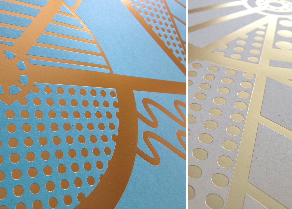
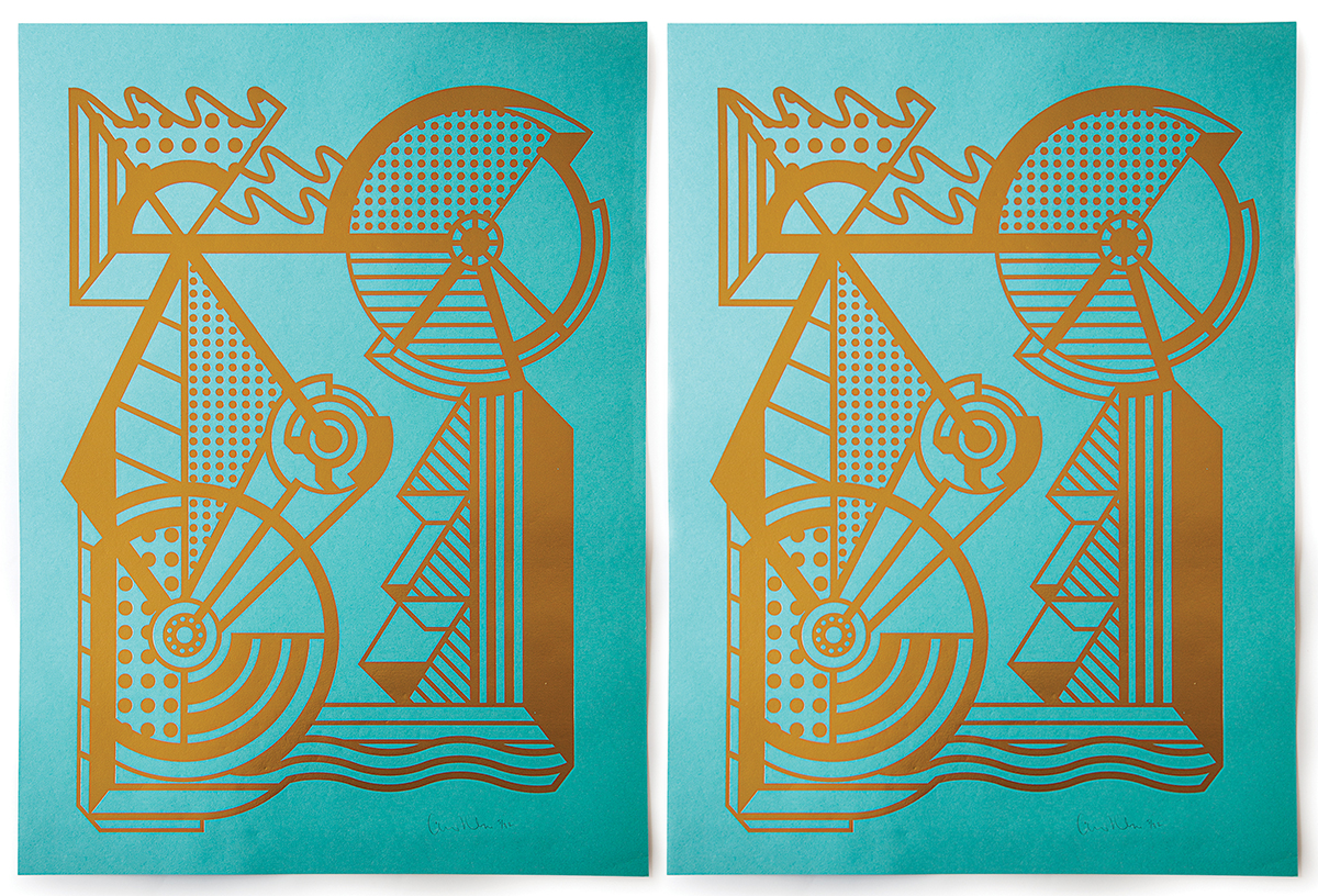
Above: Gold Bicycle (2013) came to me from right outside my old apartment. This gold bicycle would be locked up for a few weeks at a time—it almost became a permanent fixture, a piece of art, architecture—or perhaps someone really was riding it everyday. It got me thinking about how riding a bicycle can become this kinetic art form within a city. Just as architecture and sculpture can help bring life, character and essence to a city, so can the people who embody it. As a biker, we create a sculptural movement, a concrete addition to the character of a city. These posters were created differently than my past screen printed posters, as they were gold foil stamped and turned out beautiful! Here an animated process of some of the design:

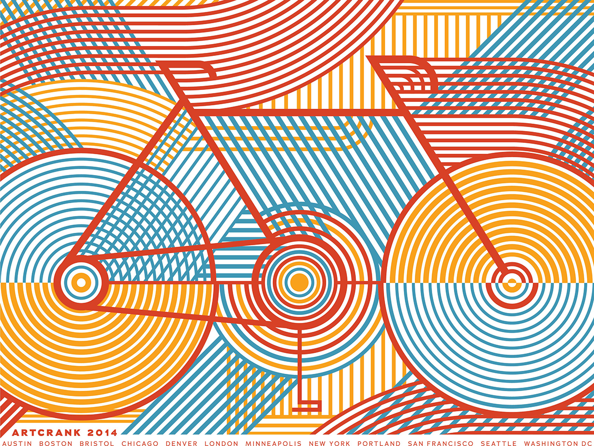
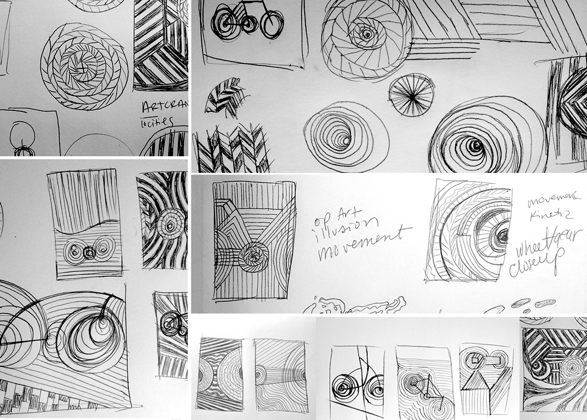
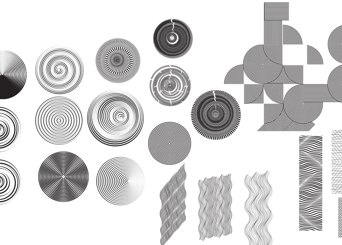
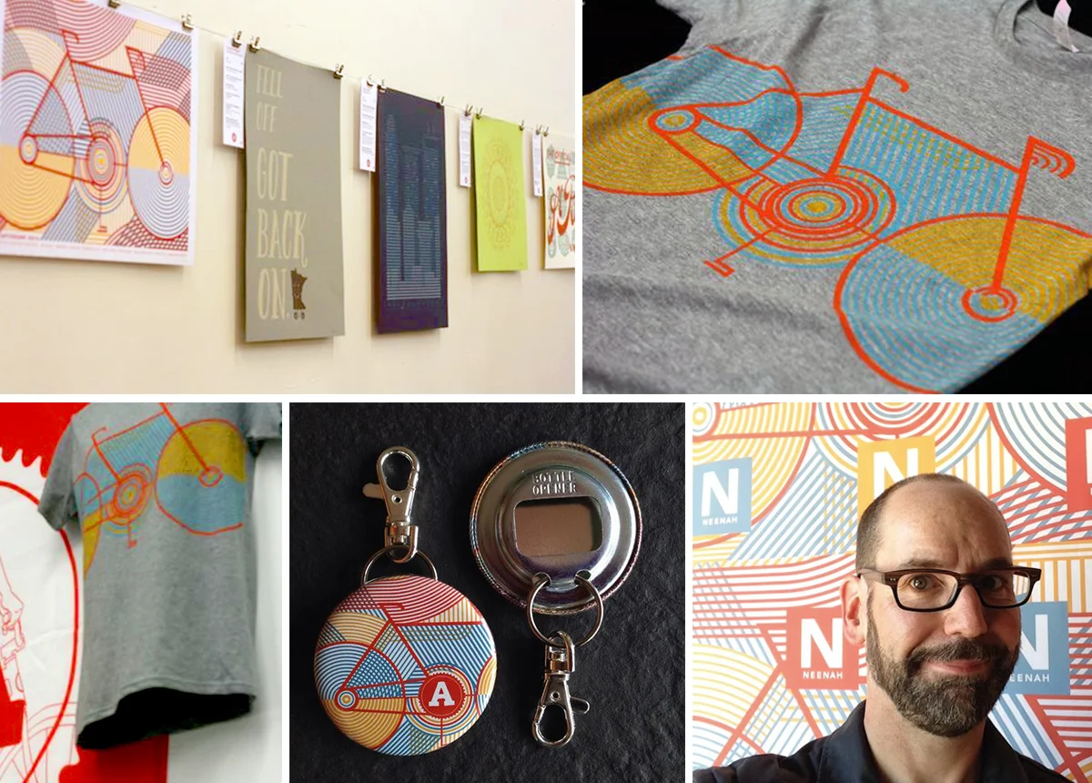
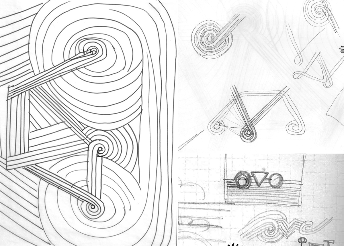
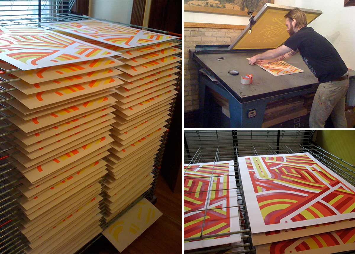
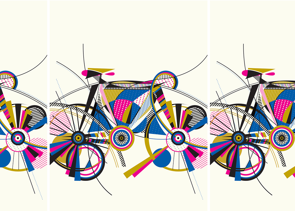
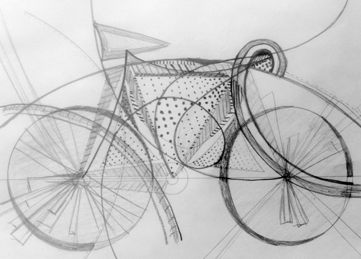
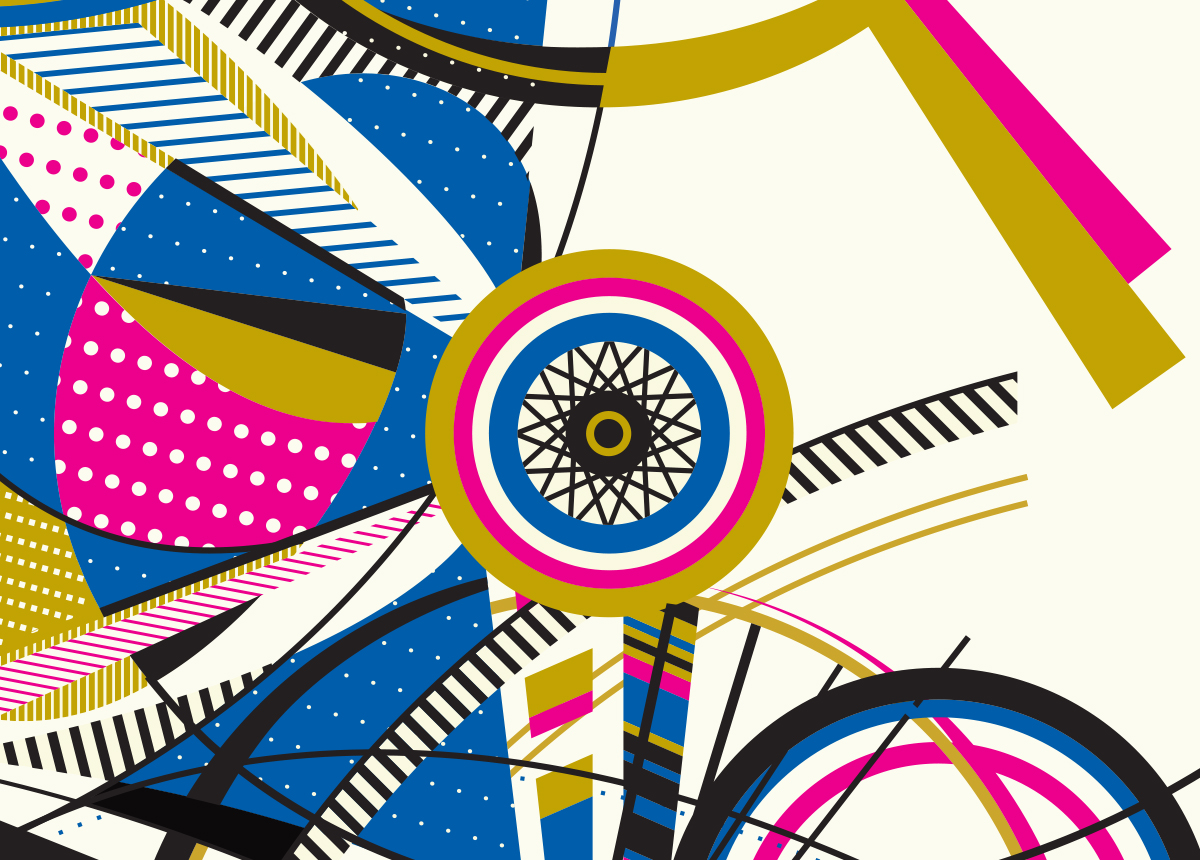
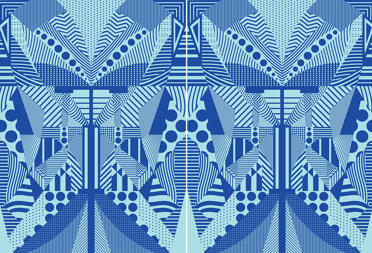
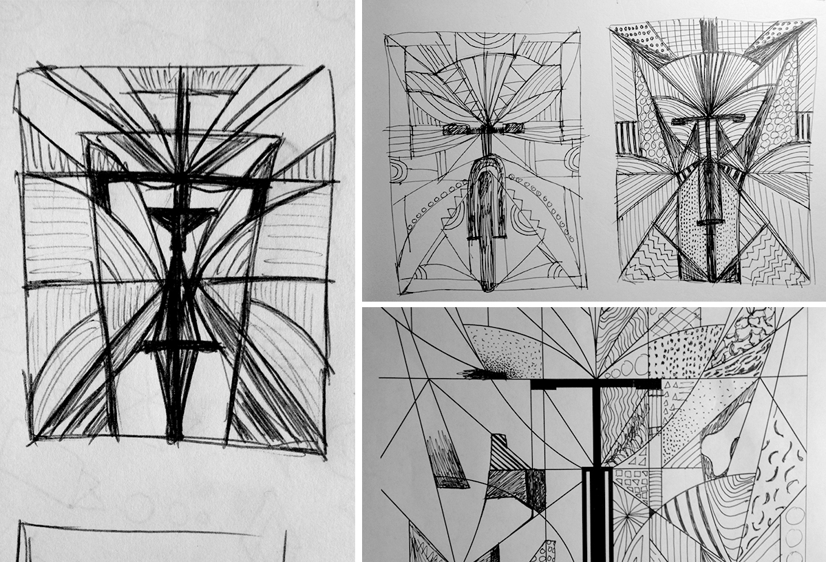
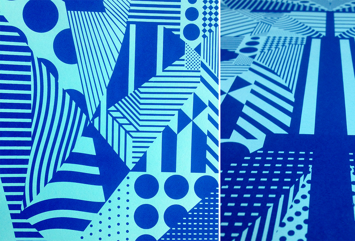
Above: In 2014 I was so incredibly honored to have been asked by Charles to work with him to create the official “tour poster” of all the 2014 Artcrank shows. They narrowed down to a select 12 cities to travel around to and wanted a poster to represent Artcrank as a whole, as well as have that artwork benefit multiple other uses. Aside from the poster, which was screen printed on white Plike (smooth plastic-like paper), we used the artwork for a photo backdrop, buttons, tshirts as well as a bunch of marketing materials for the events. The idea behind this poster is optical illusions, tricking the eye into seeing other things, other patterns, colors, etc. I wanted to create the illusion of movement, a spatial experience, using a precise and repeating pattern and overlapping color.
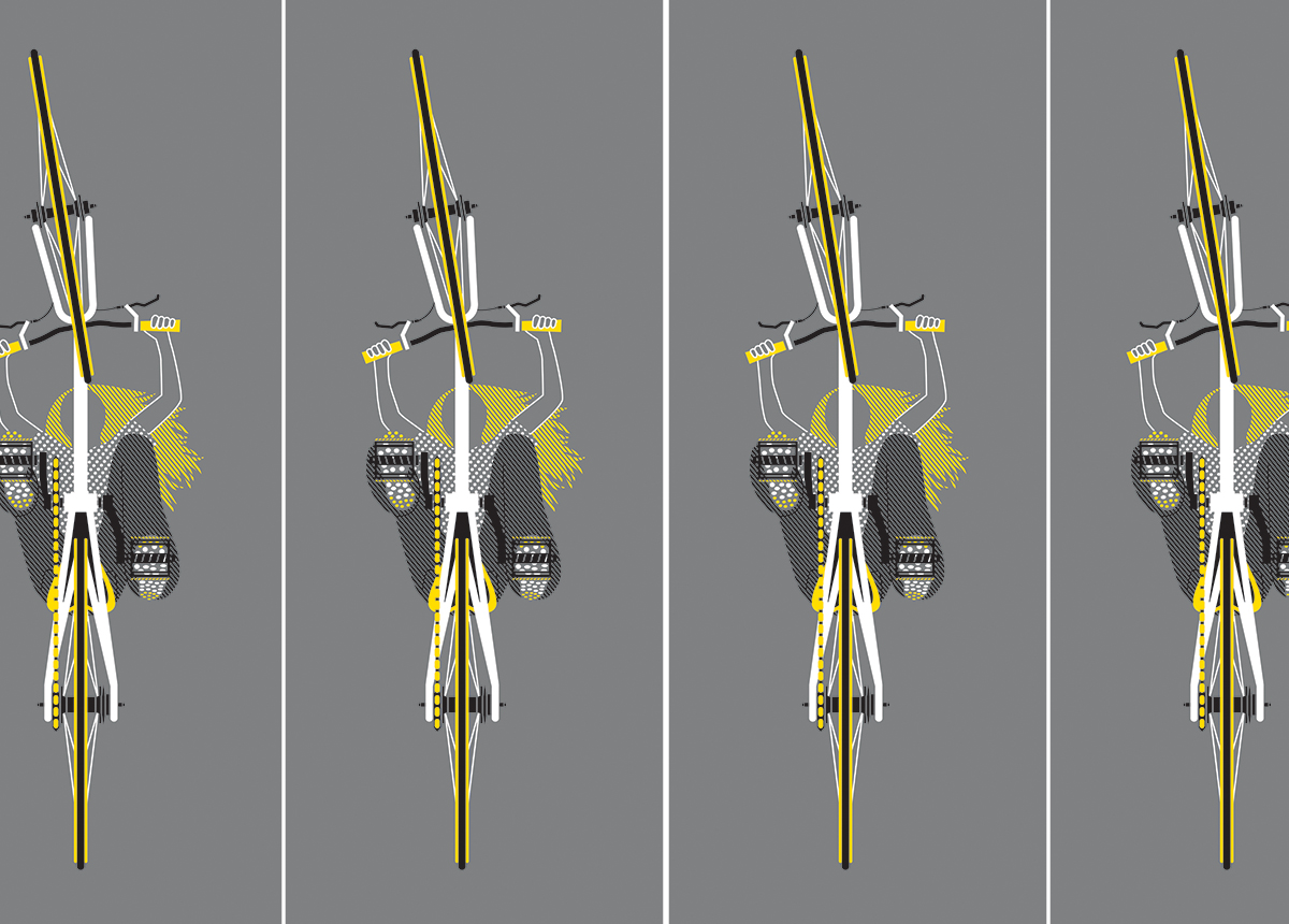
Above: In addition to creating the tour poster, I still got the opportunity to create my own poster for the Minneapolis show. I created Balance (2014) a form a stability and symmetry. When objects are in motion, they stay balanced through speed and momentum, surroundings become a blur of abstractions and a movement in harmony.